basis reporting refresh
Bringing clarity, trust, and actionable data to enterprise ad campaign reporting
00

problem
Basis Platform's reporting infrastructure had fractured into four disconnected tools, each serving overlapping needs, none serving them well. Data inconsistencies eroded user trust, clients lacked native visualization options, and users were left guessing which tool to use for any given task. Meanwhile, the platform was carrying nearly $2 million in annual third-party reporting costs that were delivering a subpar experience.
solution
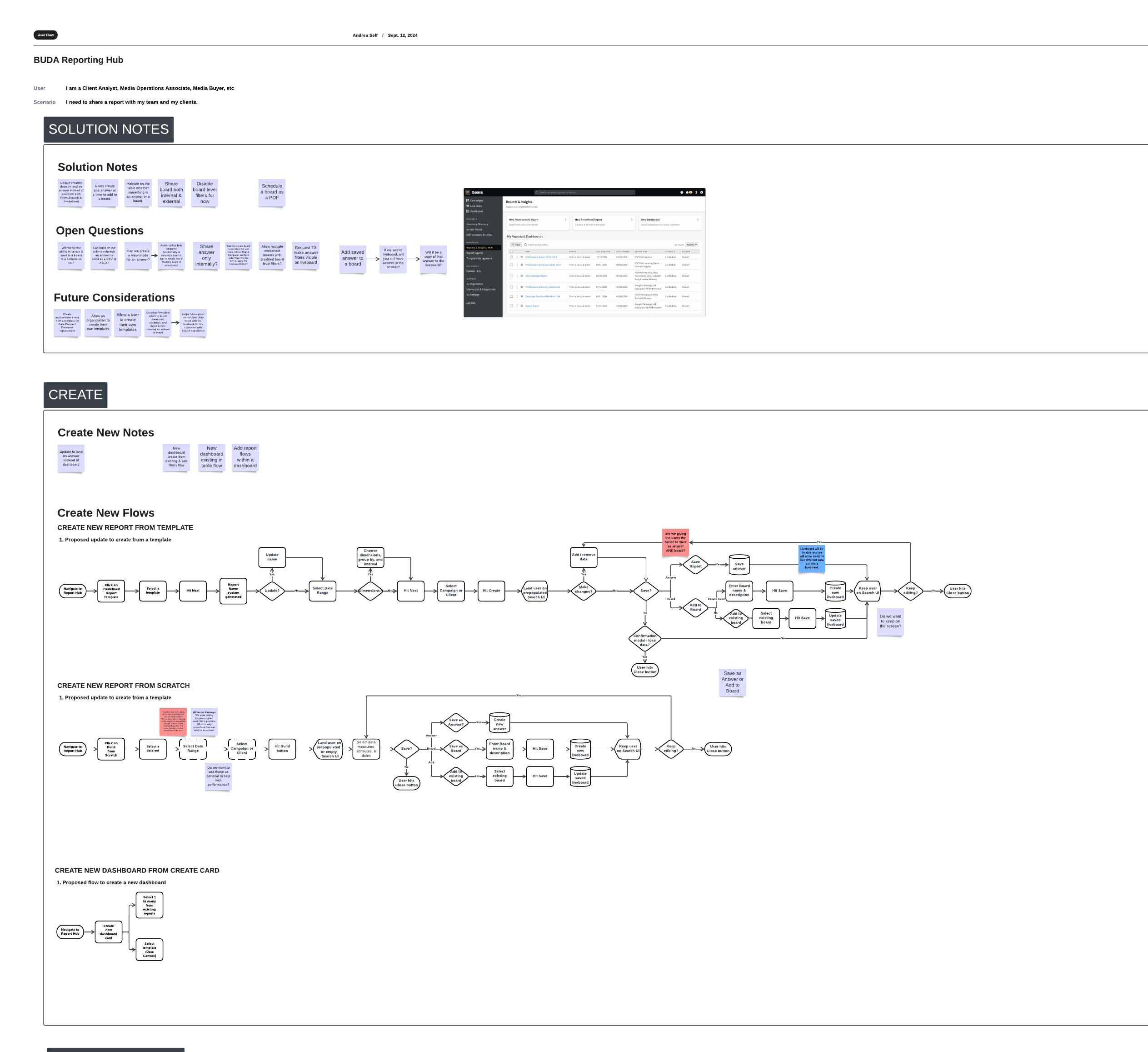
A unified reporting hub where users choose between creating a Report or Dashboard, and then select custom or from a template. The deceptively simple entry point is the result of extensive discovery, competitive research, and a mid-project pivot that separated reports and dashboards into distinct creation experiences, giving users clearer mental models and more flexibility than the original single-surface approach would have allowed. The hub launched in June 2025. A post-launch Voice of the Customer survey of 87 users returned an overall satisfaction score of 7.0/10, with users consistently praising the data depth, customization flexibility, and time savings the new tool delivered. Feedback also surfaced clear next priorities, metric discoverability, template flexibility, and dashboard workflow, which I helped advocate into the active roadmap.
Scope and leadership context
This project spanned multiple years and required sustained design leadership through three significant scope changes driven by leadership transitions, evolving business objectives, and technical constraints. The MVP originally targeted replacement of a single tool; by launch, it encompassed all four. I was the sole designer for the majority of the project, with an associate designer joining a few months before release. Following launch, I transitioned primary ownership to that designer — moving into a consulting and mentorship role while shifting my own focus to more strategic, platform-wide work including IA and AI pattern guidance. I remain involved in roadmap discussions to ensure reporting decisions reflect the broader platform experience.
Discovery
With no defined requirements at the outset, we ran a broad discovery effort across user interviews, heuristic evaluations, competitive analysis, current-state task flows, and use case mapping. I had prior depth from my work on Data Canvas, Basis's existing dashboard product, so I organized and synthesized existing research and documentation to accelerate cross-functional ramp-up rather than starting from scratch.
Cross-functional heuristic evaluations, spanning design, product, research, engineering, and technical writing, gave us a shared baseline. The synthesis surfaced themes no single team would have identified alone.
For competitive analysis, I reviewed 24 platforms: 13 DSPs and ad serving platforms and 11 reporting and analytics tools. I focused on terminology standardization, report creation patterns, and how platforms visually represent data across different user tasks, insights that directly shaped our taxonomy and interaction model.
As interviews deepened, we uncovered needs well beyond the initial scope: organizational-level reporting for budgeting and resource allocation, finance workflows for reconciling contractual vs. actual spend, and historical campaign data being pulled from an entirely different tool than expected due to granularity gaps. These findings reshaped the problem definition, and what the MVP needed to address.

Defining the right experience model
A pivotal mid-project decision came when engineering proposed changing the integration approach with our third-party tool, ThoughtSpot. The original plan used a single dashboard feature for both reports and dashboards, consistent, but limiting. After evaluating the tradeoff with product and engineering, we shifted to distinct creation experiences for each. I documented the rationale and interaction logic through detailed user flows so the full team could build from a shared foundation.
Wireframes and iteration
The wireframe process was extensive, shaped by three scope expansions and the challenge of designing a hub that had to serve the needs of four retiring tools while remaining coherent on its own. For report creation specifically, we made a deliberate decision to mirror the legacy tool's creation flow to ease the transition for existing users. This was the right call for launch, but post-release feedback quickly confirmed what we'd suspected: users wanted more flexibility from the start, particularly the ability to edit the underlying data of a template without rebuilding from scratch.
Looking ahead
To get ahead of post-MVP roadmap decisions, I led a design studio with designers and a researcher exploring how reporting could be embedded directly within campaign workflows, how users might customize data views, drill into granular data, act on insights in context, and generate reports without leaving their workflow. These concepts informed the product team's longer-term planning even where they didn't ship directly.

At a cross-functional Reporting Summit in Chicago, we also ran a structured pre-mortem to proactively surface risks ahead of the first release, part of a broader shift toward treating this as a living product with real operational stakes, not just a feature delivery.
What the data told us after launch
The post-launch Voice of the Customer survey cut through the noise quickly. Of 164 categorized mentions across five themes, two tied for most discussed at 51 mentions each: UI intuitiveness and navigation, and metrics and data availability. Users loved the data depth — they struggled to find what they needed within it. Speed and performance generated 40 mentions, with users praising the time savings of instant reporting while flagging reload times as a workflow killer. Templates surfaced the most negative ratio of any theme: users relied on them to get started, but found them too rigid and too slow to customize.
Critically, much of the friction around navigation and performance traces to ThoughtSpot's embedded UI, a constraint the design team had limited direct control over. Being able to distinguish between what was a product design problem and what was a third-party integration problem was essential for focusing the right conversations with the right stakeholders.
The clearest design opportunity the data surfaced was report creation flexibility — something the team had intentionally deferred to ease the launch transition. I worked with both product experience and product leadership to ensure it became an active roadmap priority, using the VoC data and my accumulated project context to make the case. That advocacy is now translating into the next phase of work.
year
2023 - 2025
timeframe
2 years
tools
Figma, Lucid
category
featured
01

02

03

04


