nxp & freescale post-merger ia
Merging two large-scale semiconductor sites into a unified digital presence following the acquisition of Freescale by NXP
00

problem
When NXP acquired Freescale Semiconductors, both companies brought substantial web presences to the table — each with its own information architecture, brand system, content strategy, and community infrastructure. Engineers, developers, and purchasing teams who relied on these sites needed continuity and clarity, not a fractured transition experience. The challenge was to merge two complex, content-heavy sites into a coherent whole while simultaneously evolving the brand for the combined company — and to do it across multiple teams with different responsibilities and working styles.
solution
A unified site built on Freescale's existing web architecture, with NXP's brand system translated into digital-first guidelines and applied consistently across the merged experience. Key workstreams included merging Solutions and Applications pages into a consistent page architecture, redesigning the search results experience to surface structured product content alongside traditional results, updating the Support section to clarify the combined support pathways, and creating a mobile app style guide to ensure consistency across both companies' existing app portfolios. Throughout, I served as the primary bridge between the Creative Services team driving the rebrand and the Online Experience team responsible for the site's structure and implementation.
The team and my role
I joined Freescale's Creative Services team as a Web Designer, then moved to the Online Experience team as a UI Designer — a shift that put me closer to IA and UX decisions rather than purely visual execution. When the NXP merger was announced, my position at the intersection of both teams became structurally important. Creative Services owned the new brand identity; the Online Experience team owned the site architecture and implementation. Business analysts and product managers drove content and IA decisions collaboratively. I was the person translating between all of those groups — taking brand decisions from Creative Services and making them work on the web, and bringing web constraints and user considerations back into brand conversations.
Merging the IA
NXP's decision to use the Freescale web architecture as the foundation simplified some choices while creating others. The content from both sites still needed to be rationalized — duplicate sections identified, terminology reconciled, and navigation restructured to serve users who might have known either site well but not both.
One of the more visible IA decisions involved what to call the pages that organized NXP's product applications by industry and technology. Freescale called them Applications pages. NXP called them Solutions. Early in the merger we moved toward Solutions — NXP's terminology — but user feedback eventually brought us back to Applications, which better matched how engineers actually described their work. I explored layout options through sketching before moving to high-resolution mockups, evaluating how to present Applications and Technologies content consistently across a range of industries from IoT to automotive to mobile. The final pages used a modular structure with a hero, video content, application and technology links, and featured product areas — scalable enough to work across very different subject matter.

Translating the brand to digital
NXP's brand guidelines had been developed primarily for print and marketing materials. Translating them to web required making a range of decisions the original system hadn't addressed: how typography scaled across screen sizes and contexts, how the color palette worked in interactive states and on dark backgrounds, how the iconography library applied to UI elements vs. marketing contexts, and what standards should govern the mobile app portfolio across both companies' existing apps.
I created digital brand documentation and a mobile app style guide that gave both internal teams and external vendors a consistent reference. The mobile app work was particularly complex because both Freescale and NXP had existing app portfolios with established visual languages — the style guide had to allow for app-specific personality while enforcing enough consistency that the combined portfolio felt like it came from the same company.
Search: bringing product intelligence into results
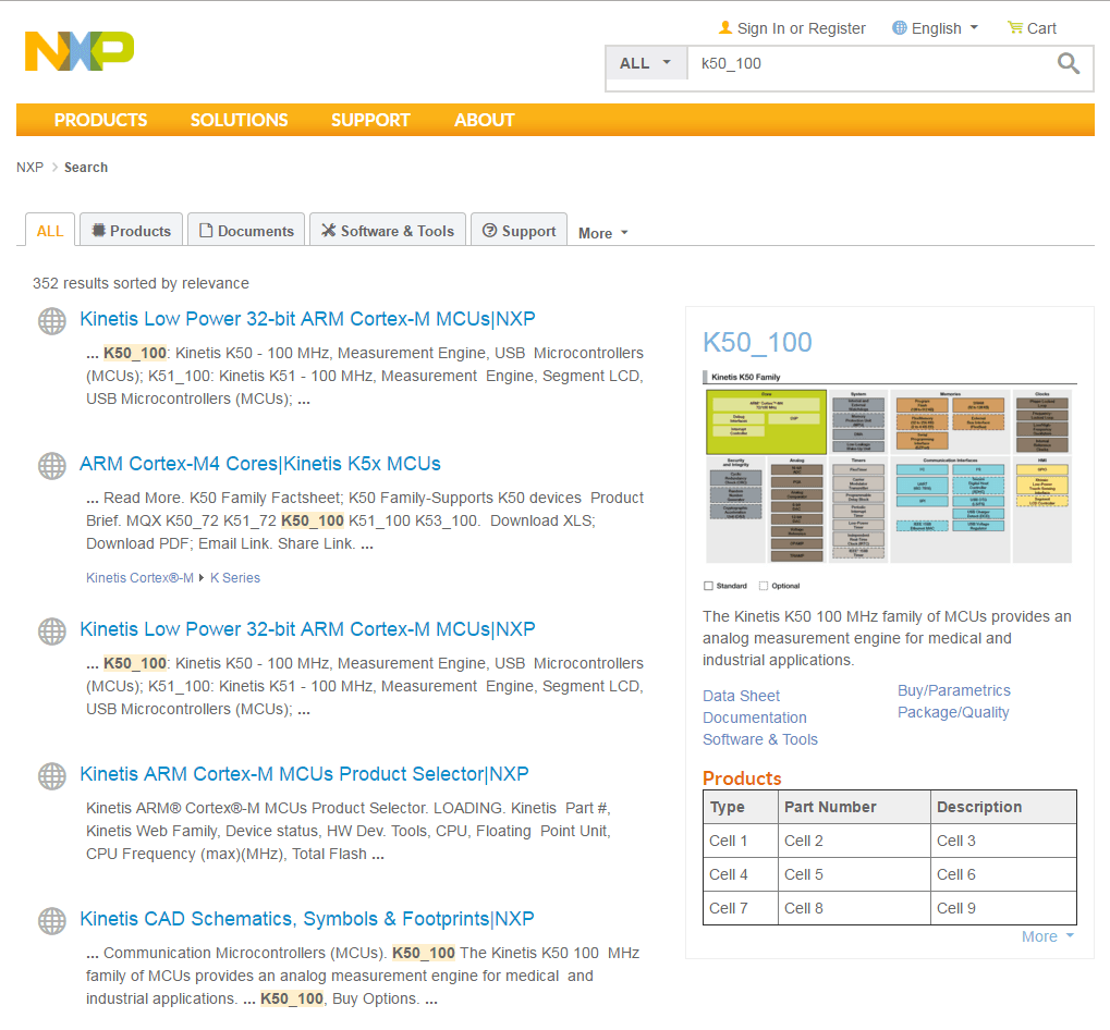
One of the more technically interesting projects was the search results redesign. NXP's product catalog is enormous — microcontrollers, processors, sensors, connectivity chips, and more, organized into families, series, and individual parts. A standard search results page returned links with text snippets, which gave engineers little to work with when they were trying to identify the right part or product family for a project.
The brief was to make the results page behave more like Google — but the real opportunity was the rich snippet panel alongside standard results. I designed a contextual panel that surfaced structured product content depending on what the search matched: a Family result showed subcategory descriptions and a product family diagram; a Series result showed a product selector visualization and a parametrics table; a Product result showed a block diagram, key links (Data Sheet, Documentation, Software & Tools, Buy/Parametrics), and an inline parts table. Each content type had its own visual treatment while maintaining a consistent panel structure.
I worked primarily through HTML and CSS prototypes provided via browser dev tools, giving the development team implementation-ready references rather than static mockups alone. The result was a search experience that let engineers quickly identify whether they were looking at the right product tier and navigate directly to the resources they needed — without having to click through to each result individually.
Support page consolidation
The Support section inherited the complexity of two separate support systems — different sign-in requirements, different ticket systems, different community channels. I worked on clarifying the hierarchy of support pathways across the merged site, designing layout options that distinguished between community-based support, formal ticket submission, and non-technical issues. The work went through multiple responsive iterations to address how the three-column layout functioned across different viewport sizes.

Outcomes
This was a long-running, multi-workstream engagement across 2+ years spanning both the Freescale and NXP periods. Specific metrics weren't tracked at a project level in a way I have access to, but the site successfully launched as the unified face of the merged company — serving a global engineering audience across products, applications, community, and support. The Applications page terminology change, driven by user feedback post-launch, is a good example of the iterative nature of the work: decisions made at merger time got refined based on how real users engaged with the content.
year
2014 - 2015
timeframe
2 years
tools
Adobe, HTML, CSS
category
featured


