txdot right-of-way
replacing legacy systems with a unified web application for roadway project management across internal departments and vendors
00

problem
The Texas Department of Transportation's Right-of-Way department managed complex land acquisition and roadway project workflows across a fragmented set of legacy applications. Internal employees, external vendors, such as road construction companies, land surveyors, railroad companies, all needed access to the same underlying processes, but the existing tools were disconnected, difficult to navigate, and full of workflow inefficiencies that had accumulated over years of patchwork development. Multiple nested screens made it impossible to compare related records without repeatedly drilling in and backing out. Requirements processes weren't surfacing the full complexity of how data actually related across the system.
solution
A custom web application replacing several legacy programs, designed to serve both internal TxDOT employees and a range of external users within a single, coherent experience. The Right-of-Way feature consolidated several nested legacy screens into a single comparison view, allowing users to work across multiple related records simultaneously — a change that required uncovering data relationships the requirements process had missed entirely. The feature launched to strong reception from the Right-of-Way department, standing out as the most positively received area of the new application across all departments at release.
The project and my role
I joined this project as a UX Designer through NTT Data, working within an Agile environment to build prototypes and interaction designs in UXPin and Adobe XD, collaborating with product owners, business analysts, and SMEs through an iterative discovery process. When NTT Data was replaced mid-project due to client dissatisfaction and budget constraints, I was one of two members retained from a UX team of five. I interviewed with the incoming vendor and transitioned into the UI/UX Lead role — taking on strategic oversight of the application's UX direction, absorbing UI development responsibilities, and managing the work of the remaining UX designer on the team.
Building trust to get closer to the work
One of the most important decisions I made on this project wasn't a design decision — it was asking to be in the room. The product owner for the Right-of-Way feature had deep domain expertise from his time working in the department, and he typically led focus groups and feedback sessions with departmental teams independently. Other UX designers on the project weren't included in similar sessions for the features they were in charge of.
I worked to build a genuine collaborative relationship with him, and eventually earned the opportunity to join those sessions alongside him. That access changed what I was able to do. Rather than designing from secondhand requirements, I could observe how different teams within the department actually worked, hear their language, and understand the friction points they were living with. I was then able to work with the business analysts to help shape better requirements — not just respond to them.
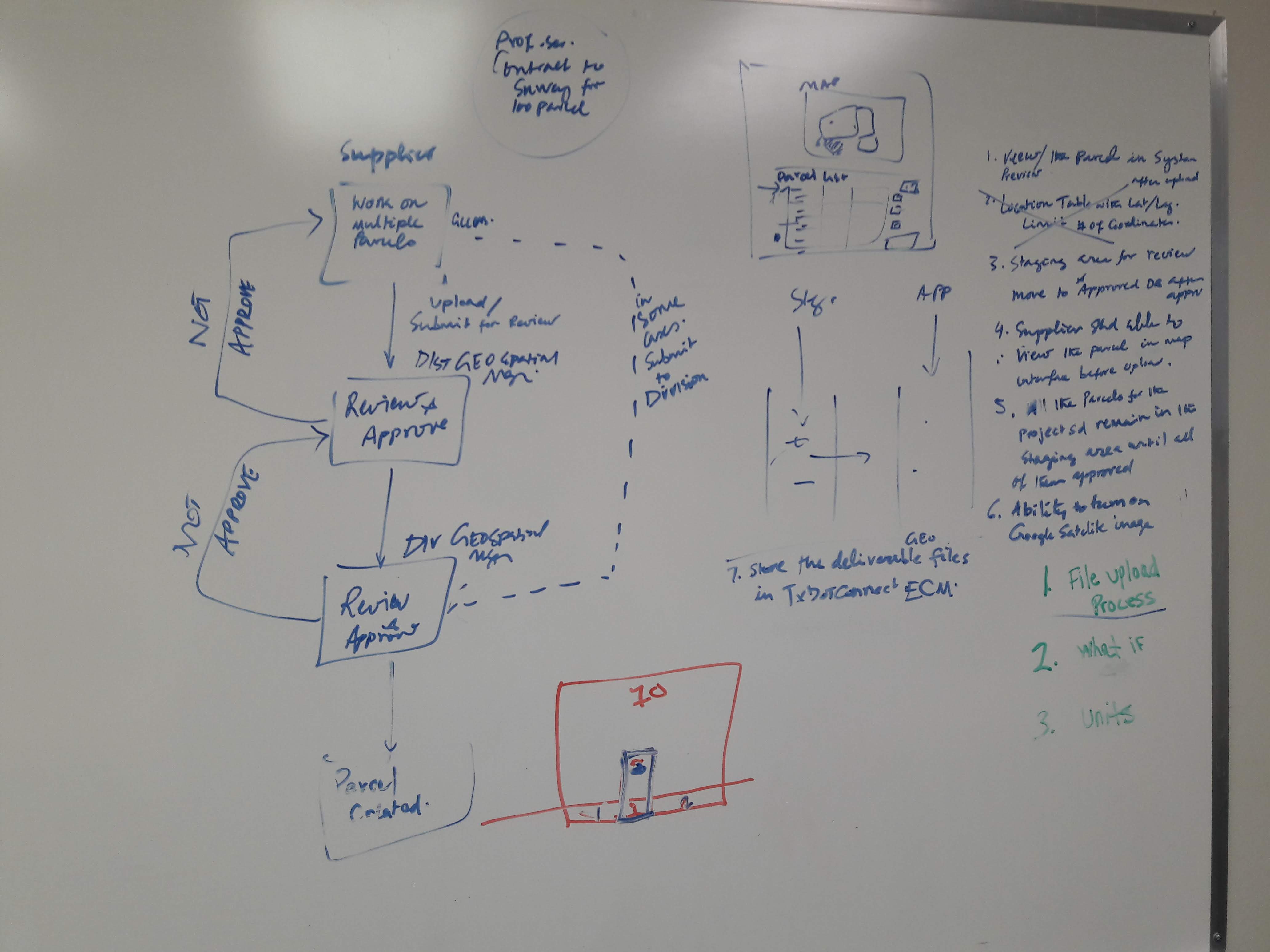
Land parcel survey upload approval process
Finding what the requirements missed
The most consequential discovery on the Right-of-Way feature came from a gap in the requirements, not from a user interview. The business analyst leading the appraisal section had documented a set of screens based on the legacy application's structure — but had missed how the data across those screens actually related to each other.
I was given direct access to the legacy application to conduct my own assessment. Something felt off about the nested screen model, so I went further — combing through the database architecture to map the hierarchy of related fields and confirm my suspicion about how the data was connected. Once I understood the relationships, I brought what I found back to the BA and walked him through it. We then validated the data model with users directly, confirming the relationships before any of those pages were built.
That insight was what made the consolidated appraisal view possible. By understanding how multiple records actually correlated, I was able to collapse five nested screens into a single page where users could compare information across records side by side — eliminating the repetitive drilling in and out that the legacy system required. It was a meaningful usability improvement, and it happened because I went looking for something the process hadn't surfaced.
Designing for the map
The Right-of-Way feature also introduced a mapping challenge the rest of the application hadn't faced. Previous features relied on the base street-view map layer, but property acquisition work required adding a topographic satellite view — and that changed everything about how visual indicators needed to behave. I needed to select a set of colors to communicate the stages of approval for individual land parcels, and those colors had to work legibly across both map layers, across different monitor calibrations, and with sufficient contrast between each stage to be distinguishable at a glance. As a government application, accessibility wasn't optional — it had to meet a high standard, which meant the color system couldn't rely on hue alone and had to hold up under WCAG contrast requirements. The research and testing process was extensive: evaluating candidate palettes across layer types, simulating different display settings, and validating contrast ratios before landing on a system that worked reliably across all the contexts a real user might encounter.
Maintaining standards across a complex system
Beyond the Right-of-Way feature, a significant part of my work as UI/UX Lead was maintaining design standards for a system with multiple stakeholder audiences. I maintained two versions of the standards library: a developer-facing version with code samples and implementation details, and a higher-level version for product owners and non-technical stakeholders. Keeping both current and useful while the application continued to evolve required ongoing coordination across product teams, enabler teams, and scrum teams.
Outcomes
The Right-of-Way feature launched to notably positive reception from the department — standing out from other areas of the new application in how warmly it was received by users. That response was communicated directly to me by the product owner, and reflected the cumulative result of the access, trust, and collaborative discovery work we had built together over the course of the project.
year
2018 - 2020
timeframe
2 years
tools
UXPin, Adobe XD
category
featured
01

02

03

04


